
In today’s digital age, having a website that looks great on all screens is essential for any business that wants to succeed online. But with so many different devices and screen sizes to consider, it can be difficult to know where to start. That’s where responsive website design comes in.
Creating a website that adapts to different screens ensures that your visitors have a seamless and user-friendly experience no matter their device.
In this article, we’ll explore the benefits of investing in a responsive website design and how it can help you to reach more customers, increase engagement, and drive more conversions.
What is Responsive Website Design?
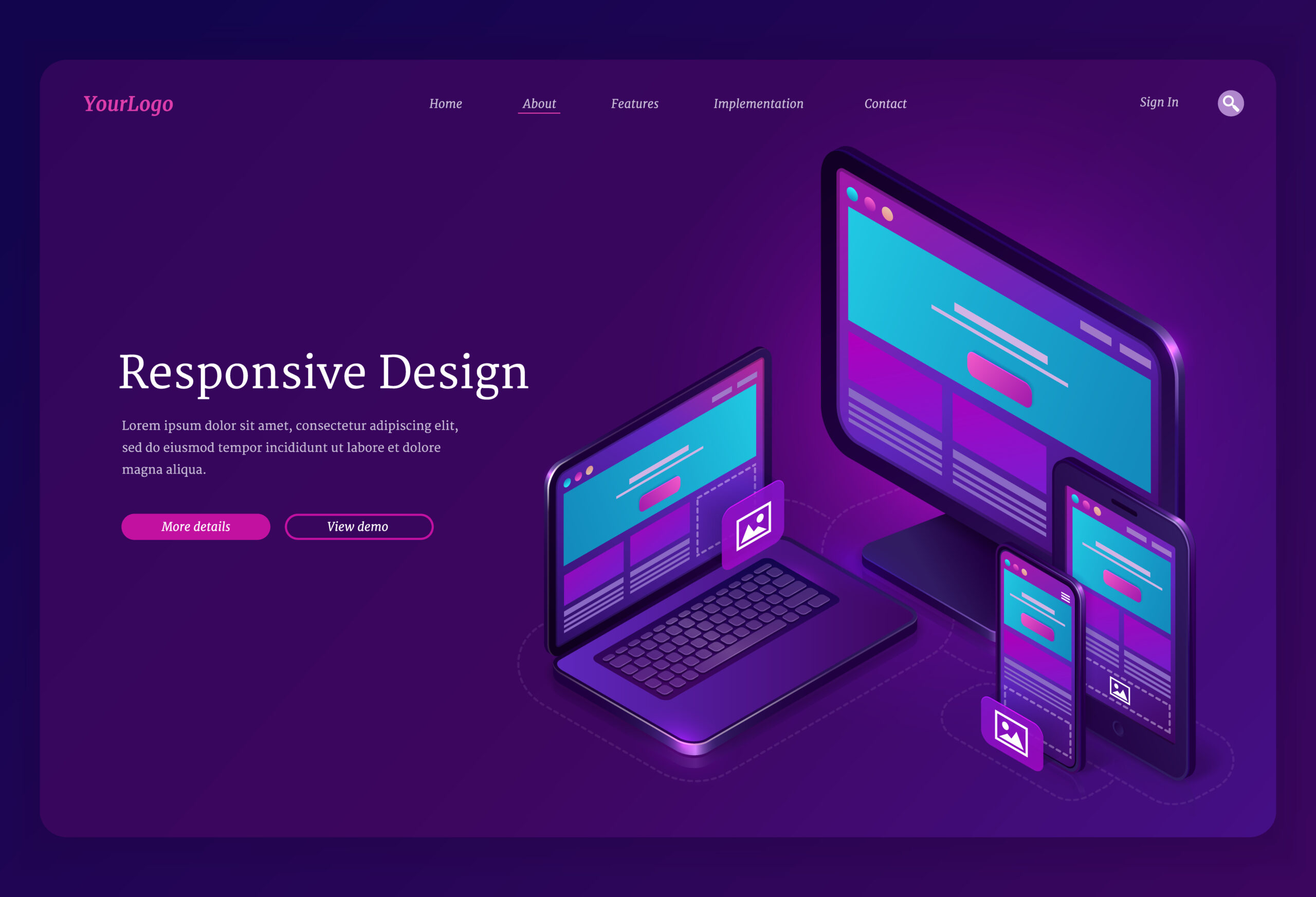
Before diving into the benefits of responsive website design, let’s first define it. In simple terms, a responsive website design is one that adapts to the size and shape of the screen it is being viewed on.
A responsive design ensures that your content will look great regardless of whether your visitors use a desktop computer, tablet, or smartphone.
This means that your visitors won’t need to zoom in or scroll around to read your text and can navigate your site easily no matter their device.
The Benefits of Responsive Website Design
- Improved User Experience:
The most obvious benefit of investing in a responsive website design is that it will improve the user experience for your visitors. Ensuring that your site looks great and functions well on all screens will provide your visitors with a seamless and enjoyable browsing experience.
This can build trust with your audience and encourage them to stay on your site longer. As a result, it will increase the chances that they’ll make a purchase or contact you for more information.
2. Better SEO:
Another benefit of responsive website design is that it can improve your search engine rankings. Google and other search engines prioritize mobile-friendly sites, so having a responsive design can help you to rank higher in search results.
This means more people can find your site when searching for products or services like yours, which can translate into more traffic and leads.
3. Increased Conversions:
A responsive website design can lead to increased conversions. If your website is optimized for all devices, users are likelier to stay on your site for longer and engage with your content.
This can result in more leads, sales, and revenue for your business.
4. Cost-Effective:
Rather than having multiple versions of your website for different devices, responsive website design allows you to have one website that adapts to all screen sizes.
This can be more cost-effective in the long run, as you won’t need to invest in multiple versions of your website.
5. Increased Reach:
With more people accessing the internet on their mobile devices than ever, a responsive website design can help businesses reach a wider audience.
Businesses can attract and retain more users by providing an optimal browsing experience on all devices.
This can lead to increased brand awareness, more website traffic, and more business.
How to Get Started with Responsive Website Design
If you’re convinced that investing in a responsive website design is the right choice for your business, the next step is to start working on your site. Here are some tips to help you get started:
- Choose a Responsive Theme
If you’re using a content management system like WordPress, there are plenty of responsive themes available that you can use to get started.
These themes are designed to be mobile-friendly right out of the box, so you won’t need to do much tweaking to get them to look great on all screens.
- Optimize Your Images
One of the biggest challenges of responsive website design is ensuring your images look great on all screens.
To do this, you’ll need to optimize your images for different screen sizes, which can be challenging.
Make sure to use high-quality images that look good at all sizes, and use compression tools to reduce the file size without sacrificing quality.
- Test Your Site
Finally, it’s important to thoroughly test your site on different devices to ensure it looks and functions as intended.
This can be a bit time-consuming, but it’s essential to ensure your visitors have the best possible experience no matter what device they are using.
Conclusion
To sum up, investing in a responsive website design is a smart choice for any business that wants to stay competitive in today’s digital landscape.
Whether you’re selling products online, providing services, or just trying to build your brand, a responsive website design can help you to achieve your goals.
So if you haven’t already, consider investing in a responsive website design for your business. Whether you work with a professional web designer or take on the task yourself, the benefits of a mobile-friendly site are clear.
So take the time to assess your current website, identify improvement areas, and start working towards a more responsive, user-friendly site today.